Why Empty Screens Matter
An empty state is often the very first thing a user sees when exploring a feature. That first moment frequently determines whether someone continues with enthusiasm or drops out immediately. If you leave it blank, it feels like a dead end. If you design it well, it becomes a starting point full of possibilities.
“An empty screen is never truly empty. It is a chance to inspire and to activate.”
Turning empty into valuable
I see a well-designed empty state as a mix of three elements:
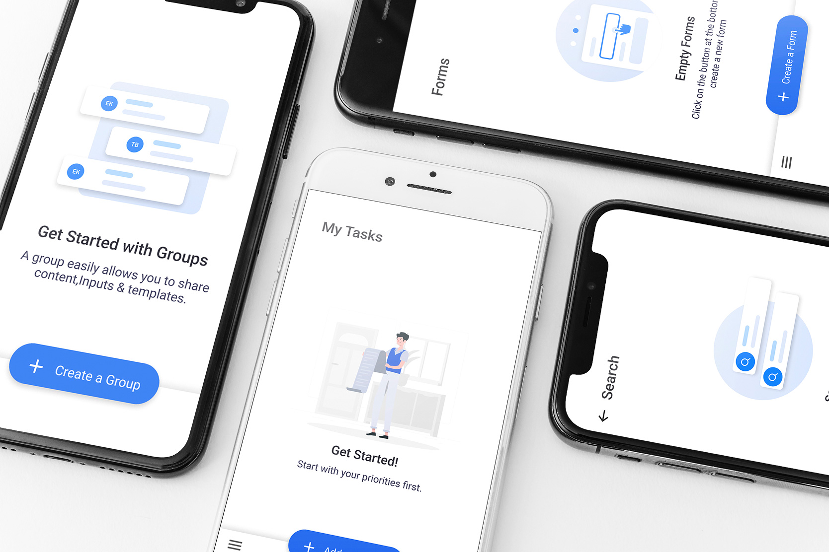
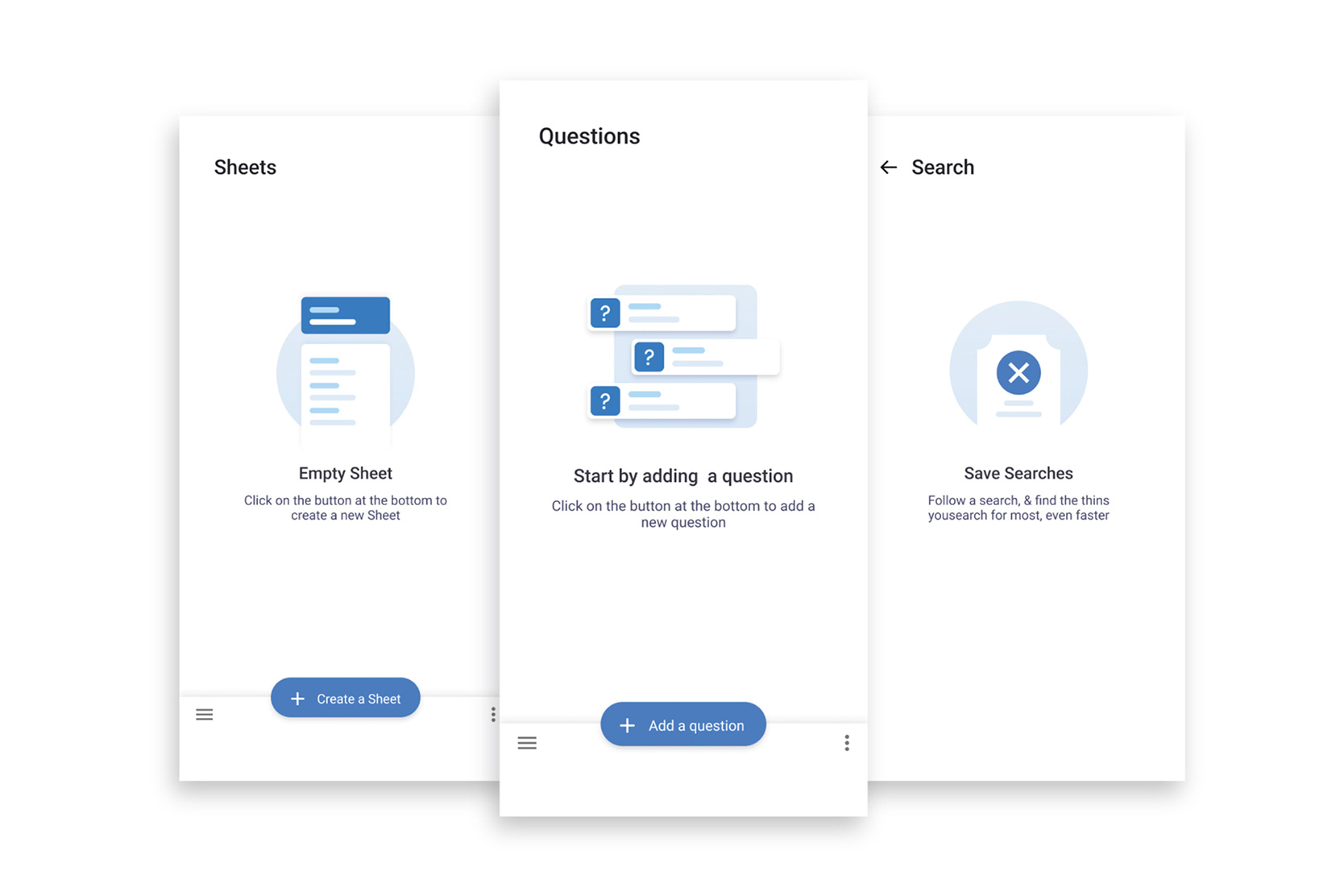
- Inform: briefly explain what this screen is for.
- Inspire: show an example or illustration that invites the user to act.
- Activate: provide a clear call-to-action, such as “Create your first project.”
From roadblock to opportunity
Over the years, I have noticed that empty states are still treated as an afterthought. I regularly come across dashboards that simply display the message “no data available.” For a user, that quickly feels like an error message, as if something is broken rather than a natural starting point. These kinds of empty screens provide no context, no direction, and above all: no trust.
As a designer, I know this moment is often decisive for the user experience. Research shows that users decide within the first few minutes of interaction whether they will continue with a product or abandon it. An empty state can literally be the difference between adoption and churn. Too often, the focus in digital products is placed almost entirely on functionality, while important details like empty states are only considered later. The result is that users become confused more easily, require more support, and struggle to find their way, which in turn generates unnecessary support tickets.
When, instead, you design an empty state that explains why the screen is empty, inspires with examples, and immediately offers an action, you see results straight away. Users understand faster what is expected and feel less lost. It is like giving someone a clear map instead of dropping them in an unfamiliar city with no directions. This way, they reach that crucial moment much faster—the moment when the value of the product becomes clear and tangible. And that moment is essential, because research from companies like Mixpanel and Intercom shows that users who experience it within their first sessions are far more likely to return and become loyal customers.
That is why I always advocate for including empty states early in the design process. It requires relatively little effort to get it right, but the impact on usability, adoption, and customer satisfaction is enormous.
Moral of the story
Empty states are not wasted space. They are moments to connect with your user. With the right text, visuals, and a clear action, you can turn emptiness into opportunity.
How do you approach empty screens in your designs?